


React Native Theming System: Design Tokens & Dark Mode


White-Label SDK Series: Part 2 — Deep Dive into Theming
Building a flexible, type-safe theming system with automatic dark mode
Series Navigation:
- Part 1: The Big Picture
- Part 2: Deep Dive into Theming (You are here)
- Part 3: Building Reusable Components
- Part 4: Configuration Architecture
Sample Repository: The complete SDK and example apps referenced in this series are available at atomicrobot/react-native-white-label-blog-sample-repo. Smaller code snippets are shown inline; longer implementations can be explored in the repo.
In brief: A well-designed theming system lets clients launch a fully branded React Native app by changing a handful of values in a config file. This post builds that system from the ground up — brand colors, semantic tokens, dark mode detection, and the
useThemehook — with TypeScript ensuring every resolved value is guaranteed to exist. All code is in the sample repo.
Your theming system is going to make or break the whole white-label experience. Get it right, and clients can launch a fully branded app by changing a few hex codes. Get it wrong, and you’ll spend forever hunting down hardcoded colors. This is the approach we bring to React Native projects at Atomic Robot, and it scales cleanly from a simple brand color swap to full enterprise design system parity.
In this part, we’ll build a theming system that’s:
- Hierarchical: Brand colors flow into semantic colors automatically
- Type-safe: TypeScript catches invalid color names
- Dark-mode ready: Responds to system preferences
- Override-friendly: Components can escape the system when needed
Design Tokens: The Foundation
Design tokens are the variables every component references instead of hardcoded values. Change a token, and every component using it updates — that’s what lets a client rebrand an entire app without touching a single component.
We organize tokens into layers, each building on the previous one.
Layer 1: Brand Colors
Brand colors are what clients customize first—they’re the “personality” of the app. These include the primary action color (buttons, links), secondary accents, and status colors (success, warning, destructive).
The key insight is that brand colors are intentional. A primary color of #007AFF (iOS blue) sends a different message than #E91E63 (vibrant pink) or #00796B (professional teal). Clients choose these colors to match their existing brand identity.
The specific slots — primary, secondary, status colors — follow the conventions you’ll find across most design systems. We’re not reinventing that; we’re adopting a pattern clients already recognize and making it configurable.
We provide sensible defaults (typically iOS system colors), but expect most clients to override at least the primary color.
Layer 2: Semantic Colors
Okay, so we have brand colors. But you don’t want developers reaching for brandColors.primary every time they need to style text. That’s where semantic colors come in. The semantic name describes purpose, not appearance — colors.text rather than a hardcoded hex.
Why does this matter? Because semantic colors let us:
- Swap entire palettes: Light mode and dark mode use different values for the same semantic names
- Maintain consistency: Every component using
colors.textupdates together - Communicate intent: A developer sees
colors.destructiveand knows it’s for dangerous actions
Common semantic colors include:
- Text hierarchy:
text,textSecondary,textTertiary(establishes visual importance) - Backgrounds:
background,surface,surfaceSecondary(canvas and elevated content) - Boundaries:
border,borderSecondary(dividers and containers) - Interactive:
tint(links, active states—often connected to brand primary) - Inputs:
inputBackground,inputBorder,inputPlaceholder
The critical connection: in light mode, tint typically equals brandColors.primary. This is how changing one brand color cascades to every interactive element.
See the full brand and semantic color definitions: packages/sdk/src/tokens/colors.ts
Layer 3: Light and Dark Variants
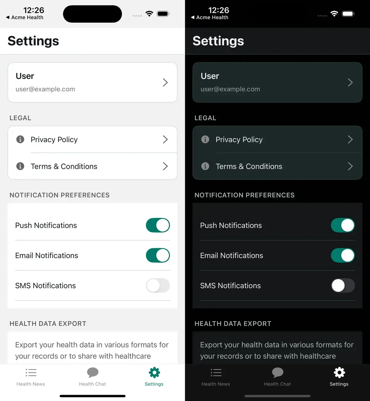
Each semantic color needs concrete values for both modes. Dark mode isn’t just “invert the colors”—it requires intentional design:
- Text: Off-white (
#ECEDEE) instead of pure white, which is too harsh - Surfaces: Lighter than background (opposite of light mode) to create elevation
- Shadows: Higher opacity because they’re less visible on dark backgrounds
- Some brand colors: May need adjustment for sufficient contrast
We define a Colors object with light and dark keys, each containing the full set of semantic colors.
Layer 4: Spacing and Border Radius
Inconsistent spacing is the kind of thing that makes an app feel unpolished without anyone being able to say exactly why. A fixed scale eliminates the decision entirely.
A typical spacing scale: 4, 8, 12, 16, 20, 24, 32, 48 (in density-independent pixels). This is a base-4/8 system — every value is a multiple of 4, with the main rhythm at 8px steps. It aligns with how Figma, iOS HIG, and Material Design think about spacing, so clients with existing design systems usually map onto it cleanly. Name the values semantically: xs, sm, md, lg, xl, xxl.
Border radius works similarly. Larger values feel friendlier; smaller values feel more professional. A healthcare app might use 4-8px radii; a consumer social app might use 16-24px. Clients can override these to match their brand personality.
Theme Resolution: From Partial Config to Complete Theme
Here’s the crucial question: if clients only provide partial configuration, how do we end up with a complete theme?
The answer is deep merging with smart defaults. When a client provides:
theme: {
  brandColors: { primary: '#00796B' }
}
We merge it with our defaults to produce a complete theme where:
primaryis the client’s#00796B- All other brand colors use our defaults
- All semantic colors use defaults, BUT
tintautomatically uses the new primary
This cascade is the key to the whole system. The merging happens in a resolveTheme() function that:
- Merges brand colors: Spread defaults, then spread user overrides (later values win)
- Builds light palette: Merge defaults with overrides, then connect
tintto the resolved primary - Builds dark palette: Same pattern, but dark mode
tintmight differ - Merges layout tokens: Spacing and border radius follow the same pattern
Here’s an illustrative version of the function (see packages/sdk/src/provider/BotProvider.tsx for the full implementation):
function resolveTheme(config: BotConfig['theme']): ResolvedTheme {
  // 1. Merge brand colors — user overrides win
  const brandColors = {
    ...BrandColors,
    ...config?.brandColors,
  };

  // 2. Build light palette — connect tint to the resolved primary
  const light = {
    ...Colors.light,
    ...config?.colors?.light,
    tint: brandColors.primary,
    tabIconSelected: brandColors.primary,
  };

  // 3. Build dark palette — same pattern
  const dark = {
    ...Colors.dark,
    ...config?.colors?.dark,
  };

  // 4. Merge layout tokens
  const spacing = { ...Spacing, ...config?.spacing };
  const borderRadius = { ...BorderRadius, ...config?.borderRadius };

  return { brandColors, colors: { light, dark }, spacing, borderRadius };
}
A few things worth noting: the spread order matters — defaults first, client overrides second, so later values win. The tint and tabIconSelected connections to brandColors.primary happen after the light palette merge, so client-provided semantic overrides can still win over the brand color cascade. And the output is fully typed with no optionals, which means every component downstream can use values directly.
The output type has no optionals—every value is guaranteed to exist. This means components never need to check “does this color exist?” They just use it.
The useTheme Hook
With the resolved theme in context, useTheme is the primary interface between the theme system and your components. React Native’s useColorScheme() handles light/dark detection natively — that’s all you need for a native-focused SDK. If you add web support down the line, Expo/Metro’s file extension resolution (.web.tsx) lets you swap in a platform-specific implementation without touching any component code.
The hook itself does three things:
- Gets the resolved theme from context (the merged result of defaults + client config)
- Detects the current color scheme (light or dark)
- Returns everything a component needs in a convenient shape
Components typically need:
colors— the semantic colors for the current mode (not both modes)brandColors— always available, regardless of modespacingandborderRadius— layout tokensisDark— boolean for conditional logic
Components destructure only what they need: const { colors, spacing } = useTheme(). This keeps dependencies explicit and makes the code self-documenting.
Usage looks like:
function MyComponent() {
  const { colors, spacing, isDark } = useTheme();

  return (
    <View style={{
      backgroundColor: colors.surface,
      padding: spacing.lg,
      borderColor: colors.border,
    }}>
      <Text style={{ color: colors.text }}>Hello</Text>
    </View>
  );
}
No hardcoded values. Every style references the theme. Change the theme, and this component updates automatically.
See the full hook implementation: packages/sdk/src/hooks/use-bot-theme.ts
The Escape Hatch: useThemeColor
Sometimes a component needs to break from the theme—a promotional banner with unique colors, or a special card that doesn’t match the standard surface color.
The useThemeColor hook handles this. It takes optional light/dark overrides and a fallback semantic color name. If overrides are provided, it uses them; otherwise, it falls back to the theme.
This lets you build components that:
- Use theme colors by default (when no overrides passed)
- Accept custom colors when needed (respecting light/dark mode)
- Never hardcode colors directly
Use this sparingly. Most components should just use useTheme(). The escape hatch is for intentional exceptions, not everyday use.
Putting It Together: The Type System
The type system is where TypeScript really shines for white-labeling. We use a key pattern: input types are partial, output types are complete.
The ThemeConfig interface (what clients provide) uses Partial<> everywhere. Clients only specify what they want to override—everything else is optional.
The ResolvedTheme interface (what the SDK guarantees after resolution) has no optionals — every value is defined, no null checks in components.
This asymmetry is intentional. It makes the client experience simple (provide only what you need) while making the component experience safe (everything is guaranteed to exist).
Real-World Config Examples
The power of this system is progressive complexity. Clients start simple and add customization as needed.
Minimal: Just a primary color. This single value cascades to buttons, links, active states, tab icons—every interactive element.
theme: { brandColors: { primary: '#E91E63' } }Moderate: Brand colors plus some semantic overrides. Maybe the background should be off-white instead of pure white, or the destructive color needs to match company guidelines.
theme: {
  brandColors: { primary: '#00796B', destructive: '#D32F2F' },
  colors: {
    light: { background: '#FAFAFA', surface: '#FFFFFF' }
  }
}
Full control: Complete custom palettes for both modes, custom spacing, custom radii. Some enterprise clients want pixel-perfect matching to their existing design system.
The key insight: all three levels use the same SDK. The client’s complexity is their choice, not a requirement.
The advanced example demonstrates full semantic color overrides: examples/acme-health-advanced/config/bot.config.ts
Common Patterns
Here are a few things we ran into while building with this system that are worth calling out:
Derived colors: Sometimes you need a color that’s a variant of another—slightly lighter, or different between modes. Compute it in a custom hook or inline, using isDark to branch.
Status mapping: Components like status badges map semantic states (success, warning, error) to brand colors. A simple object lookup keeps this clean and maintainable.
Theme-aware shadows: This is where the token system shows its limits — and where you learn something useful about shadows.
The shadows.ts token file bakes in shadowOpacity: 0.1 at definition time. No mode awareness. Then components like BaseFeedScreen use the same value inline:
// BaseFeedScreen.tsx — postCard style
shadowColor: '#000',
shadowOffset: { width: 0, height: 1 },
shadowOpacity: 0.1,   // same in light AND dark
shadowRadius: 2,
In dark mode, a 10% opacity shadow on a dark surface is invisible. Shadows are subtractive in light mode — a dark shadow on a light background reads clearly — but on a dark surface you need to punch through with higher opacity. The fix is to pull isDark from useTheme() and compute it inline:
function PostCard({ children }) {
  const { colors, isDark } = useTheme();

  return (
    <View
      style={[
        styles.card,
        {
          backgroundColor: colors.surface,
          shadowColor: '#000',
          shadowOffset: { width: 0, height: 2 },
          shadowOpacity: isDark ? 0.4 : 0.1,
          shadowRadius: isDark ? 6 : 4,
          elevation: isDark ? 6 : 2,
        },
      ]}
    >
      {children}
    </View>
  );
}
This pattern comes up every time you have a card component. It’s mechanical enough to inline rather than abstract, but easy to forget until your first dark mode QA pass.
Mode-specific adjustments: Some colors can’t be the same between modes. White text on a colored button works in light mode but may need adjustment in dark mode. The theme system gives you the tools; intentional design decisions are still required.
Trade-offs and Considerations
Token proliferation: The 18 semantic colors here are drawn from patterns that come up repeatedly across projects — they cover what real components actually reach for. For a simple app, half that might be enough. Start with what you know you need and add tokens as components ask for them.
Performance: Every component using useTheme re-renders on theme change. For most apps this is fine. For performance-critical lists, consider passing colors as props or memoizing.
Naming conventions: textSecondary vs secondaryText? Pick a convention and stick with it. We prefer {category}{variant} for consistency.
What’s Next
We’ve built the foundation. In Part 3, we’ll create the components that consume this theme system—ThemedText, ThemedView, and patterns for building your own themed components.
Working on a white-label or multi-brand mobile app and want to talk through how theming fits into the bigger architecture? Atomic Robot’s mobile development team works with teams navigating exactly these decisions. Reach out to us — we’d be happy to help.
Next: Part 3 — Building Reusable Components →
Photo by Yosuke Ota on Unsplash