


React Native White Label SDK: Multi-Brand App Architecture


React Native White Labeling: Part 1 — The Big Picture
A four-part guide to building production-ready white-label apps with React Native Expo
Series Navigation:
- Part 1: The Big Picture (You are here)
- Part 2: Deep Dive into Theming
- Part 3: Building Reusable Components
- Part 4: Configuration Architecture
Sample Repository: The complete SDK and example apps referenced in this series are available at atomicrobot/react-native-white-label-blog-sample-repo. Smaller code snippets are shown inline; longer implementations can be explored in the repo.
You’ve built an app that works. Now the business wants to sell it to three different clients, each with their own brand. Marketing wants a dark mode. The enterprise client needs custom authentication. And everyone wants it yesterday.
This is the white-label challenge: shipping the same core product under multiple brands, each with its own look and feel, feature set, and backend—without maintaining a separate codebase for each.
The most common answer to this problem is a template project. Fork it for each new client, tweak the colors, ship it. That works fine until the original template gets a bug fix—now you have three repos to patch, and that’s assuming you remember to update all of them. A new feature becomes three migrations. A design system refresh becomes a project in itself. You’re not building one product anymore; you’re maintaining a fleet.
The better answer is an SDK. One codebase provides the functionality. Client apps consume it and supply only what makes them different. Bug fixes ship once and reach everyone. Solving it well means one SDK, infinite brands.
In brief: A React Native white-label SDK gives you one codebase and per-client config files. This series builds one from scratch across three layers—a theming system, a reusable component library, and a type-safe configuration model—so multiple brands can ship independently without ever touching the SDK itself.
What We’re Building
Over this four-part series, we’ll construct a complete white-label SDK for React Native Expo. By the end, you’ll have:
- A theming system that handles colors, typography, spacing, and dark mode automatically
- A library of reusable components that adapt to any brand
- A configuration architecture that lets clients customize everything without touching code
- Preset screens that work out-of-the-box and base screens for full control
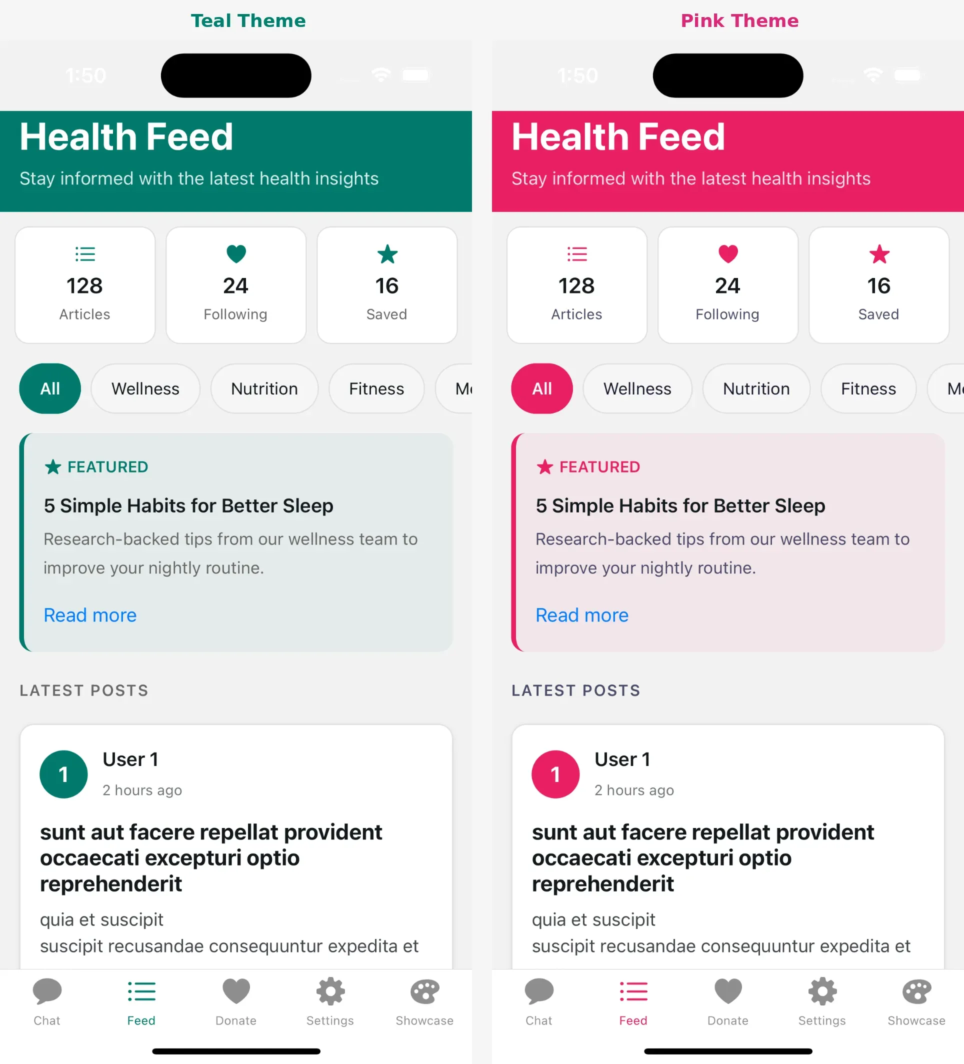
Here’s what the end result looks like for a client:
// One config file = one branded app
const config: BotConfig = {
  appName: "Acme Health", // Display name used throughout the app
  theme: {
    brandColors: { primary: "#00796B" }, // Teal primary - cascades to buttons, links, etc.
  },
  features: {
    enableChat: true, // Toggle entire features on/off per client
    enableFeed: true,
  },
  urls: {
    base: { api: "https://api.acmehealth.example.com" }, // Backend endpoints
  },
};
Three files. Fully branded app. No SDK modifications.
See the full config in the sample repository: examples/acme-health-advanced/config/bot.config.ts
The Architecture Overview
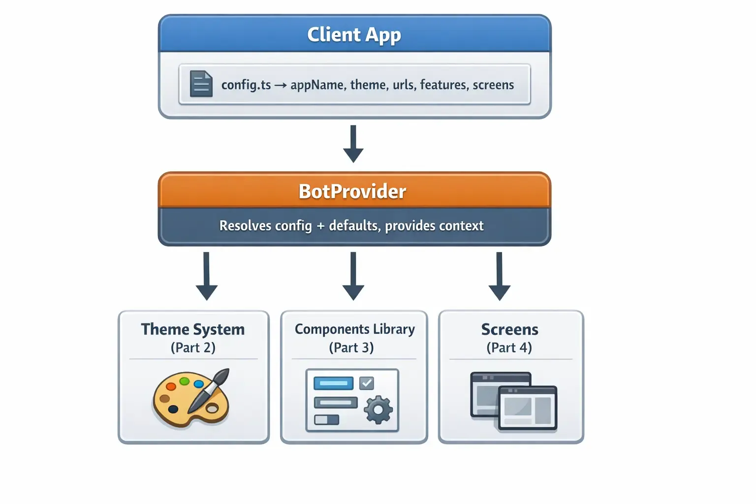
At the center sits BotProvider. Your client app passes a single config object in. The provider resolves it—merging your values with SDK defaults—and makes the result available everywhere via React Context. From there, three systems consume it: the theme engine (Part 2), the component library (Part 3), and the screen implementations (Part 4).
Nothing in the SDK reaches into client code. Everything flows one direction. That constraint is what keeps the SDK and client apps independently upgradeable: the SDK can ship a new feature or fix a bug, and client apps get it on the next install with zero code changes.
(Quick note on naming: we use a Bot prefix throughout—BotProvider, BotConfig, useBotTheme—as a nod to Atomic Robot. Feel free to rename it if you’re building your own SDK.)
SDK Folder Structure
Here’s the full picture — don’t worry, we’ll build each piece step by step across the series.
bot-sdk/src/
├── index.ts                    # Public API - what clients import
├── types/
│   └── config.ts               # TypeScript interfaces for all config options
├── provider/
│   └── BotProvider.tsx         # Wraps app, resolves config, provides context
├── tokens/                     # Design tokens - the atomic visual values
│   ├── colors.ts               # Brand + semantic color palettes
│   ├── spacing.ts              # Consistent padding/margin scale
│   ├── borders.ts              # Border radius values
│   ├── typography.ts           # Font sizes, weights, line heights
│   ├── shadows.ts              # Shadow definitions per platform
│   └── components.ts           # Component-level token presets
├── hooks/                      # React hooks for consuming theme
│   ├── use-bot-theme.ts        # Primary hook - returns colors, spacing, etc.
│   ├── use-theme-color.ts      # Escape hatch for per-component overrides
│   └── use-color-scheme.ts     # Detects light/dark system preference
├── utils/                      # Internal utilities
│   └── mergeConfig.ts          # Deep merge logic for config resolution
├── components/                 # Pre-built themed UI components
│   ├── ThemedText.tsx          # Text that adapts to theme colors
│   ├── ThemedView.tsx          # Container with themed background
│   └── ui/                     # Buttons, cards, inputs, etc.
├── screens/                    # Complete screen implementations
│   ├── base/                   # Props-driven, full customization
│   └── presets/                # Config-driven, zero code needed
└── contexts/
    └── auth-context.tsx        # Authentication state + handlers
The Three Pillars
Pillar 1: Theming (Part 2)
The theming system handles everything visual:
- Brand colors: Primary, secondary, accent, destructive
- Semantic colors: Text, background, surface, border—with light/dark variants
- Design tokens: Spacing, border radius, typography scales
- Automatic dark mode: System preference detection and response
We’ll build a system where changing one color in config updates every component automatically.
Pillar 2: Reusable Components (Part 3)
Components are the building blocks:
- Themed primitives: ThemedText, ThemedView that adapt to any brand
- Override patterns: Component-level color overrides when needed
- Composition: Building complex UI from simple, themed pieces
- Platform handling: iOS, Android, and web differences
We’ll explore how to build components that are flexible without being complicated.
Pillar 3: Configuration (Part 4)
Configuration is what makes white-labeling possible—and it’s the hardest pillar to get right. Not because the TypeScript is complex, but because you’re designing the developer experience for every team that will use the SDK. Every option you expose is a decision about what to abstract and what to leave in the client’s hands. Get the shape wrong and clients hit walls; make it too flexible and the SDK becomes an assembly puzzle.
The two-tier screen system lives in this pillar, and it exists specifically to thread that needle: preset screens let clients pick up a working feature with one config option, while base screens hand full control back when their brand or UX requirements need it.
- Type-safe config: Full TypeScript support with autocomplete
- Smart defaults: Everything works without configuration
- Deep merging: Partial configs merge with defaults intelligently
- Two-tier screens: Preset screens for quick setup, base screens for control
- Render slots: Inject custom content without rewriting screens
We’ll design a configuration system that’s powerful for advanced users and simple for everyone else.
The Provider Pattern
Everything flows through a single provider:
export default function RootLayout() {
  return (
    // BotProvider wraps the entire app at the root level
    // All child components can access the resolved config via hooks
    <BotProvider config={botConfig}>
      <App />
    </BotProvider>
  );
}
The provider does three things:
- Resolves configuration: Merges user config with defaults
- Creates context: Makes resolved values available everywhere
- Wraps auth: Provides authentication state management
Every component, hook, and screen pulls from this context.
Why This Approach Works
The template-forking approach feels faster at the start. It’s only when you’re three clients deep, with diverging bugs and a design system that needs updating everywhere, that the cost becomes obvious. This architecture is designed to avoid that.
- One config, one brand. No hunting through code to find where a color is defined. Everything lives in a single file. When a client wants a new primary color, that’s one property change—not a find-and-replace across a codebase.
- SDK and config stay separate. The SDK provides functionality. The config provides customization. They never mix. That means the SDK can ship a bug fix or a new feature, and client apps get it on the next install without touching their own code.
- Start simple, go deep when you need to. Preset screens work out-of-the-box. Base screens with render slots hand back control when a client’s UX requirements go beyond what a config option can handle.
- TypeScript does the heavy lifting. Config errors are caught before runtime. Clients get autocomplete on every option, and the compiler tells them when a value is out of range or missing.
- New features don’t break old apps. Every config option has a sensible default. Existing apps keep working when new options are added to the SDK—opt in when ready, ignore until then.
Prerequisites
Before diving in, you should be comfortable with:
- React Native basics (components, hooks, StyleSheet)
- Expo Router for navigation
- TypeScript interfaces and generics
- React Context API
Coming Up
In Part 2, we’ll build the complete theming system—design tokens, color schemes, the useTheme hook, and automatic dark mode support.
In Part 3, we’ll create the component library—ThemedText, ThemedView, and patterns for building your own themed components.
In Part 4, we’ll design the configuration architecture—type definitions, the provider, two-tier screens, and render slots.
Building a white-label app and want a second opinion on your architecture? Atomic Robot’s mobile development team works with teams navigating exactly these decisions. Reach out to us — we’d be happy to help.
Next: Part 2 — Deep Dive into Theming →
Photo by Romain Dégrés on Unsplash