

Building a Brand That Is Uniquely Atomic Robot


We’re proudly sharing a look into our new brand — one that better reflects who we are, who we’ve always been.
Atomic Robot has stood for custom-crafted digital solutions that engage and delight consumers since day one. And that’s never going to change.
As we approached our 10th anniversary, we realized it was time for our brand to reflect our mission and purpose. We collaborated with Focus Lab to create a brand that represents Atomic Robot through and through. After months of hard work, we’re excited to share a look into some of the updates we’ve made.
Displaying Personality Through Our Brand Attributes
Our brand attributes are characteristics that appear across our visual and written communications. These act as a north star to help us build a cohesive, scalable brand identity that inspires both clients and team members.
Our brand attributes are modern, crafted, and approachable.

These were informed by our mission and purpose to reflect the craft and care that we put into every single app that we create — while maintaining the nerdy authenticity that makes us unique.
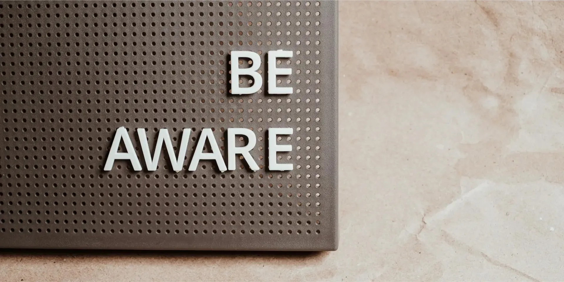
Sharing New Ideas With Our Voice and Tone
Atomic Robot’s communications adopt a wise, kind, and creative voice. You may notice that our website doesn’t just look different, but sounds different too. That’s because we’ve updated our pages to sound conversational or casually polished, where appropriate. We strive for clarity to allow our expertise to shine through in all of our communications.
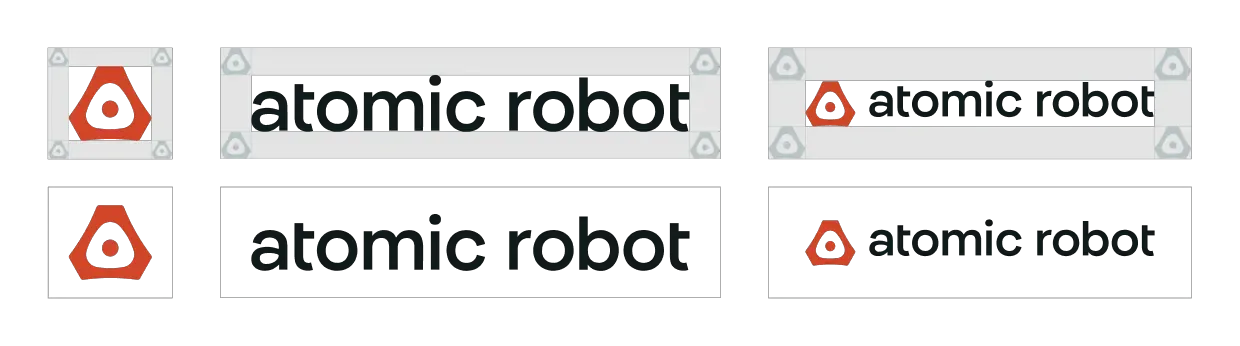
Representing Our Atomic Nucleus
The Atomic Robot logomark, dubbed “the Inner Mechanism”, represents the power source that drives us forward.
Inside the mind of Atomic Robot is a whirl of creativity, tempered by quiet, constant focus. There is a buzz of collaboration, a push and pull of playful experimentation and precise refinements.
And at the source of it all, powering the process, is our craft.
We embrace the nitty gritty — the code at the core of every application — that makes up our polished product.
Our new mark is modern and simple. It represents the polish and craft of our work, while acknowledging the core that makes Atomic Robot tick and push innovation forward.
The logotype is a modified version of the primary brand typeface, Internacional. It strikes the perfect balance of retro and professional.
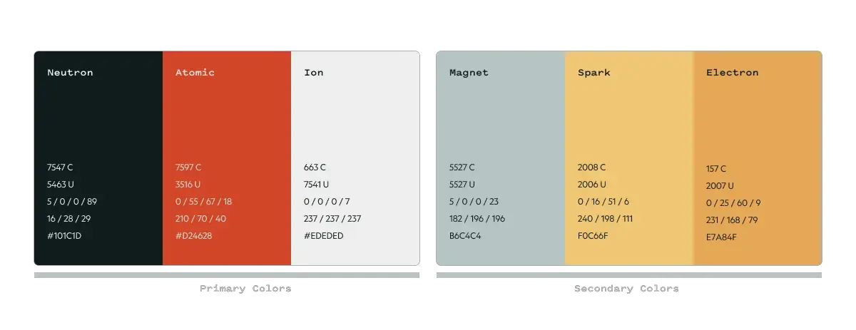
Infusing Energy With Our Color Palette
Our color palette offers a subtly vintage, space-age feel to ground our brand. It represents the idea of a technology that transcends space and time.
Building Cohesion and Hierarchy With Our Typography
Atomic Robot is leveraging three typefaces to achieve a cohesive brand with a clear hierarchy.
Internacional is our primary typeface. It’s trustworthy, professional, and modern — with a slightly retro feel.

Geograph is our secondary typeface that emphasizes the modernity of our brand through simple and crisp letterforms.

Pitch Sans is our tertiary typeface that delivers a technical feeling that speaks to our roots and expertise in the development landscape.

Introducing Our Helpful Mascot
Meet Atom. He brings energy, personality, and approachability to our brand. While he mostly lives internally, you may see him pop up in some of our gifts and swag, decks, emails, and promotional materials.

Creating a Union of Vision and Brand
We’re proud to stand behind a brand that feels genuine and authentic to who we are as we continue to grow intentionally. Our partners gravitate to us because our character carries over to the products we make –– products that feel custom-crafted, intentional, and substantial. In us, they find relatable experts who build significant partnerships and products.
Now our brand reflects who we are. We are people who want to make the world better through technology.